Chemigrams
Pierre Cordier
|
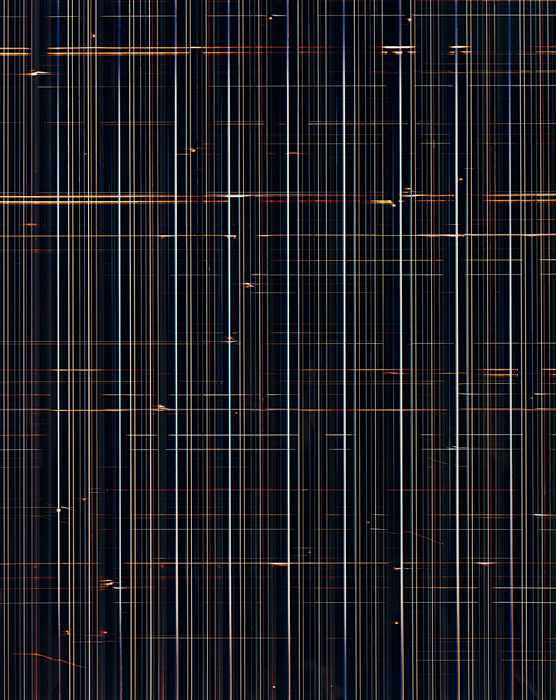
"Pierre Cordier (born Brussels, Belgium, 1933) discovered the 'chemigram' process in 1956. Over many years, he has explored the potential of the chemigram like an experimental scientist. Working more like a painter or printmaker than a photographer, Cordier replaces the canvas or printing plate with photographic paper. He applies photographic developer to the paper to create dark areas and fixer for lighter tones. Further changes to shape and pattern are made by 'localising' products such as varnish, wax, glue, oil, egg and syrup. These protect the surface of the photographic emulsion or can be incised to create a drawing, graphic motif or written text. Entrancing chemical and physical reactions can then be made by repeatedly dipping the paper in photographic developer and fixer. This method allows him to create images impossible to realise by any other means. The process has become the artwork and his style is his technique." - The Victoria and Albert museum.-
http://www.vam.ac.uk/content/articles/c/camera-less-photography-artists/ |
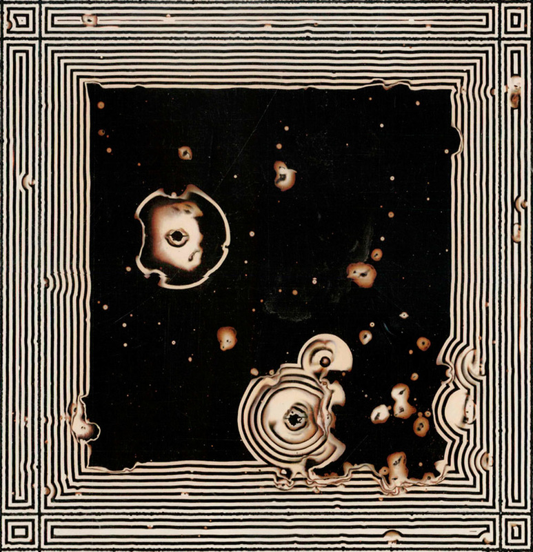
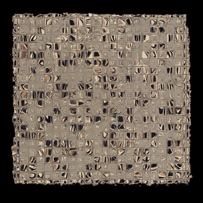

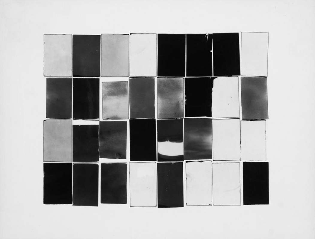
This Chemigram was taken by Pierre Cordier and is my favourite of the set above. This image has a typological kind of feel due to the repetition of the black squares, framed by the fine white pin stripes, with peculiar and original chemical effects within them. To me, this image is recognisable to have been made in a dark room as such detail and colour/ lack of are often achieved in there.
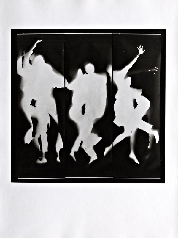
My First set of Chemigrams:
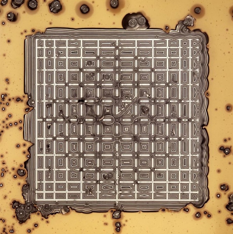
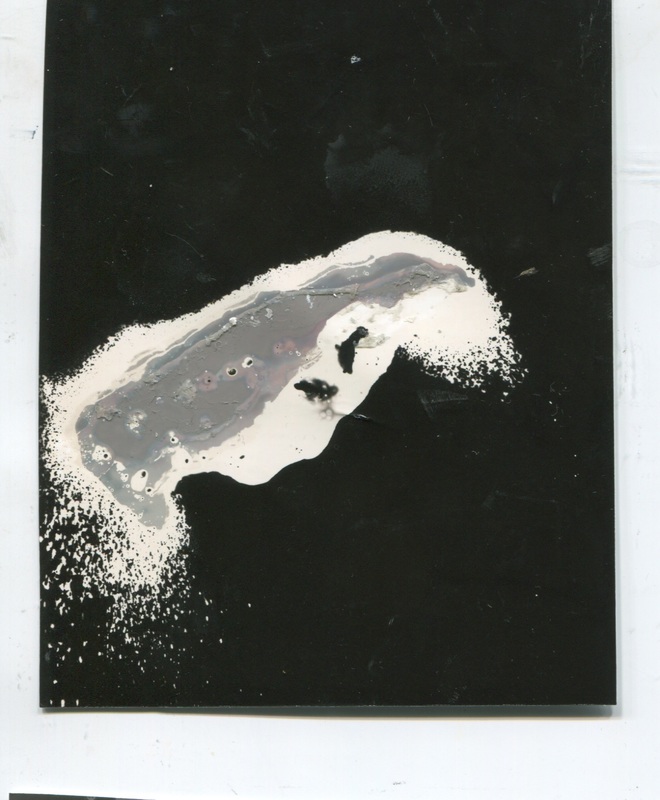
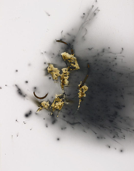
This set of Chemigrams was my first ever and I enjoyed the process very much. Some of the chemicals I used included nail polish, nail varnish, bleach, various moisturisers, kitchen cleaner spray and vaseline. The bleach and kitchen cleaner sprays created the very dotty splash effect on some of the Chemigrams, these were interesting to use because spraying from different angles create different shapes and sizes of marks. The nail polish was also very useful, it allowed me to draw shapes (with the brush or with a cotton swab) directly onto the Chemigrams. You can clearly see in which Chemigrams I used it. Although the moisturisers didn't take much effect on my images, maybe i could try another brand or type next time.

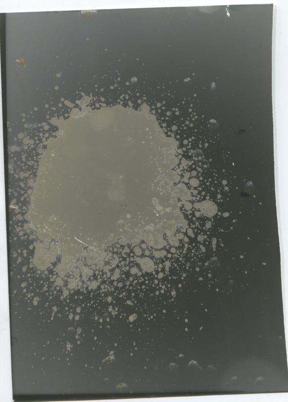
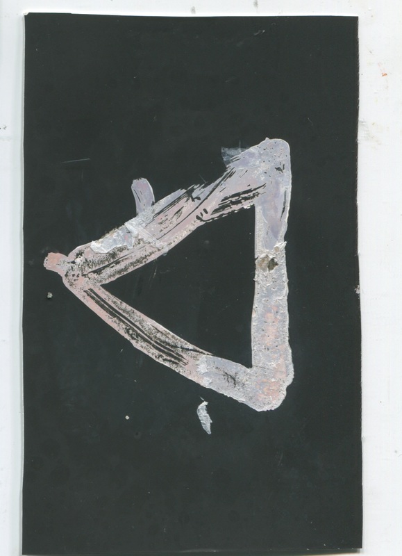
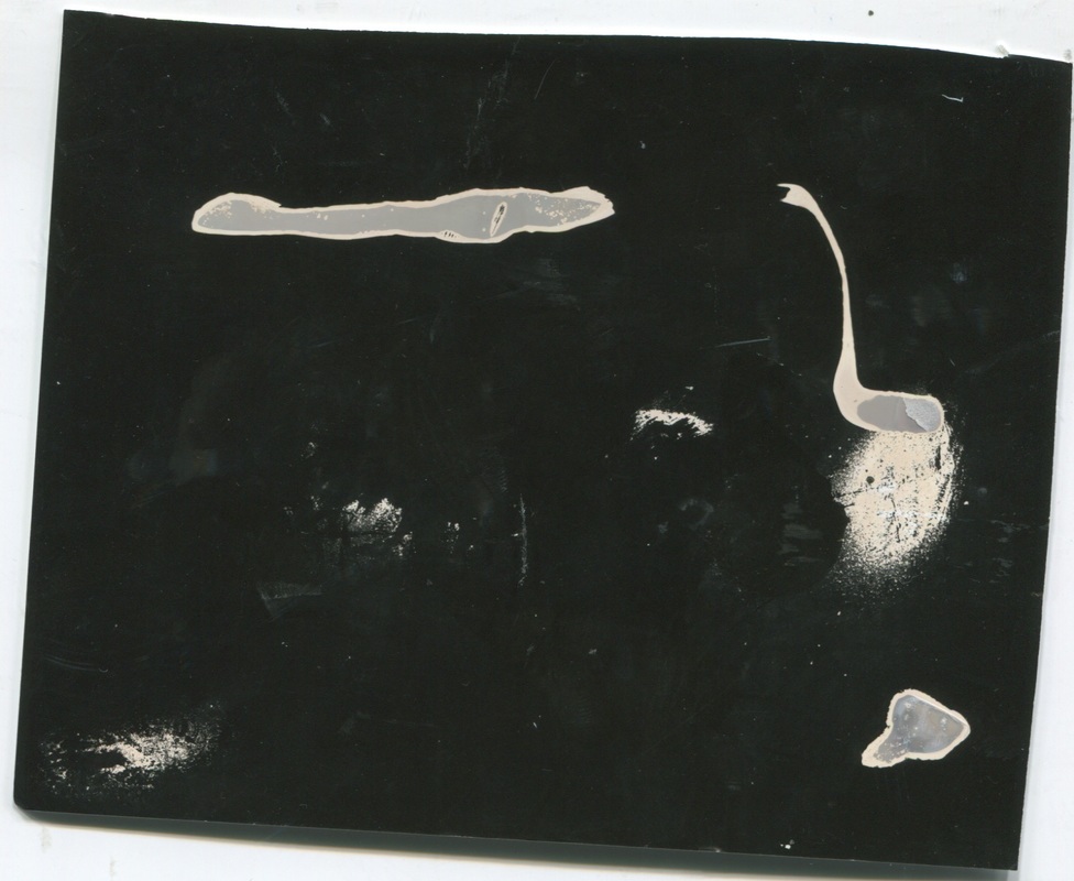
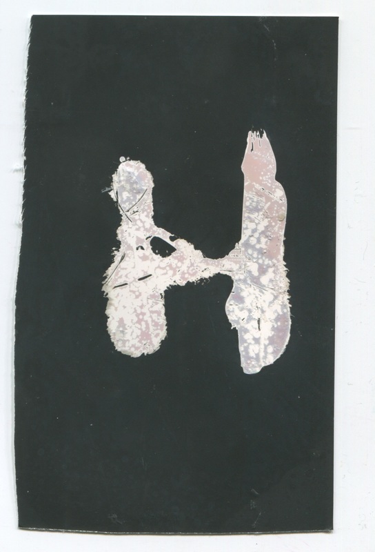
Overall, I do think that these were a successful set of images. Despite the fact that three of the nine I created were too over exposed to see a clear image, the others came out okay.
My favourite two of the set include the two with the two of which have clearly been sprayed. They have more character then the others, even if this set of chemigrams isn't very interesting. This set was made in order too try the technique so I'm not that bothered that they aren't the most meaningful of pictures. However, I'd like to pre-meditate some different compositions and try and make an other set.

|
|
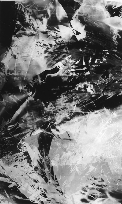
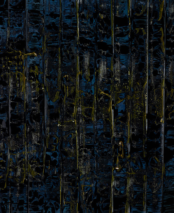
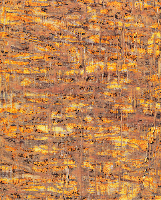
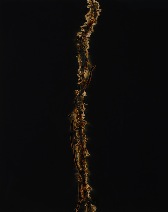
Marco Breuer
|
|
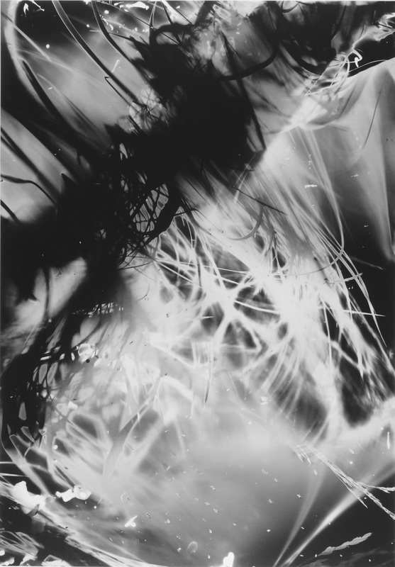
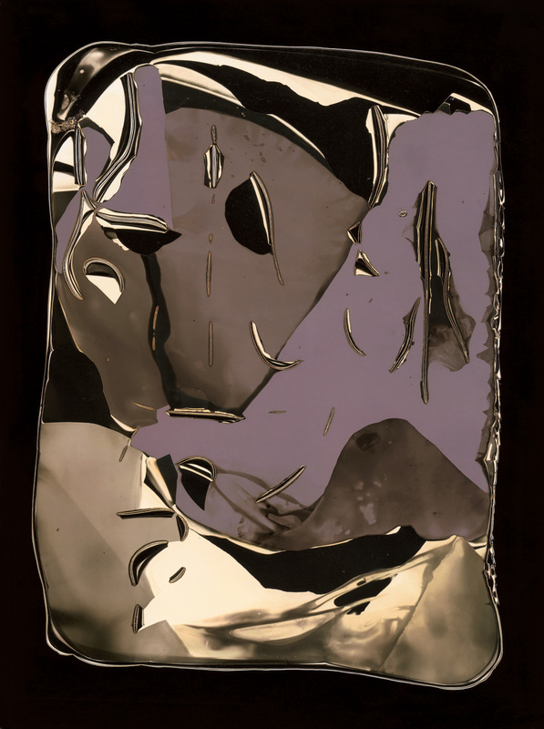
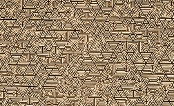
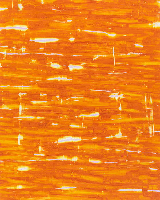
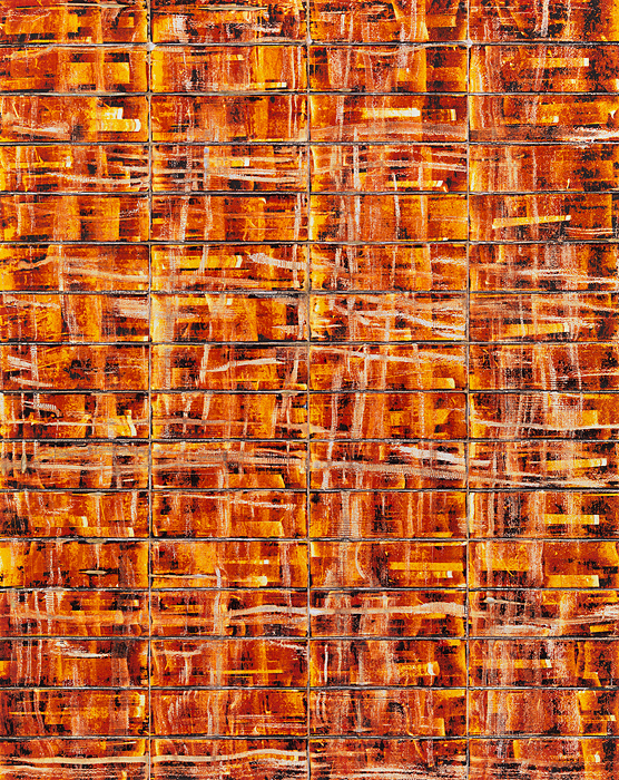
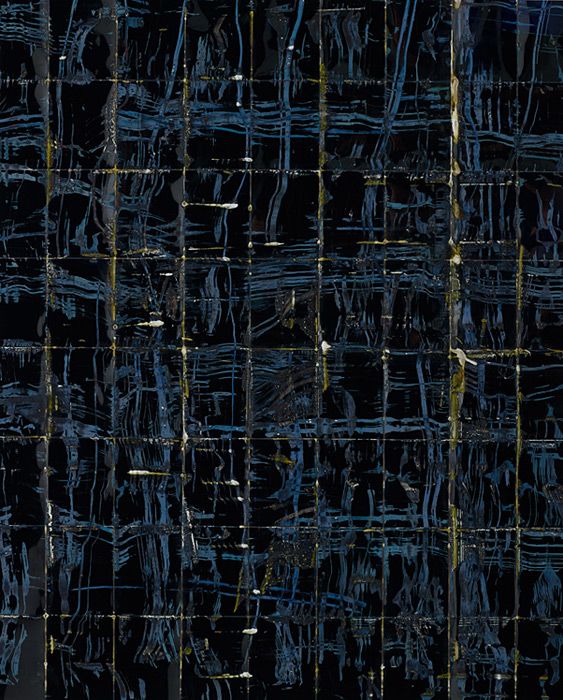
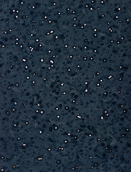
Marco Breuer is a German photographer most well known for his cameraless photography, seen on the left. His work mainly consists of a common texture and colour scheme, applied to the whole image however as you can see, there are a few that are more objective. Some people believe this kind of work is not photography. In some ways I agree because a large part of photography is that it is the closest representation to the real world and in work such as this, making chemigrams and cyanotypes, this is majorly distorted making it hard to see a representation of anything. To me, his work doesn't portray anything specific theme. On the contrary, his work is very aesthetically pleasing, its the kind of work of which would be easy to hang on your wall. The simple fact that is is pleasing to look at is enough for anyones work to be successful. The precision in which he must use when applying chemicals must be immense, the amount of detail in his work, from my small experience must have required a great amount of expertise.
|
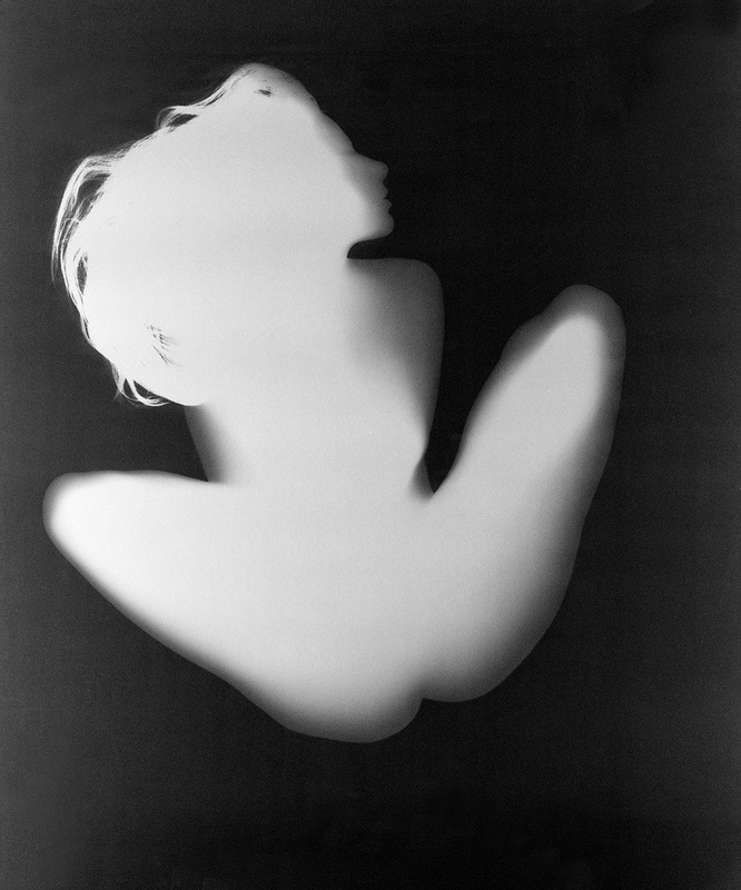
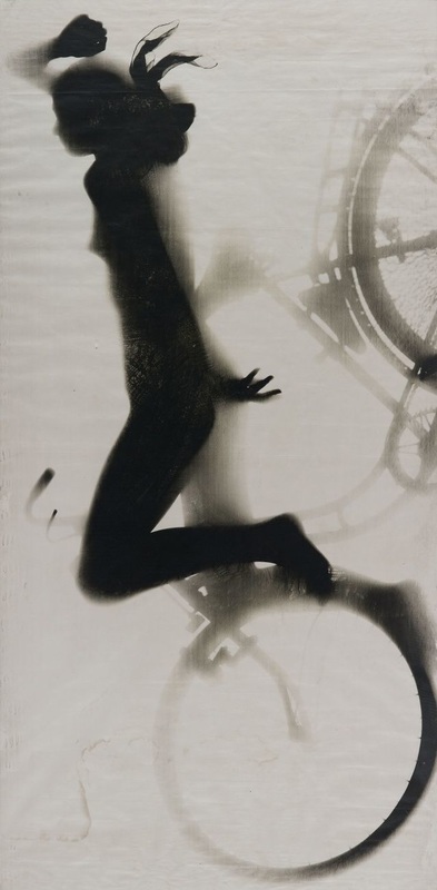
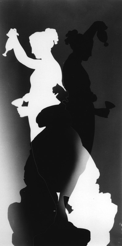
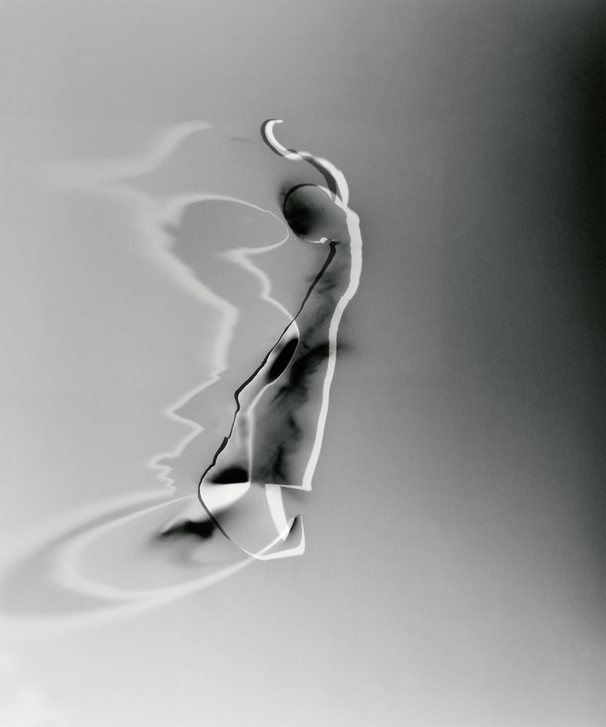
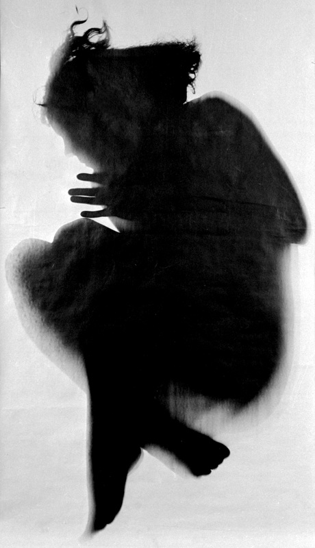
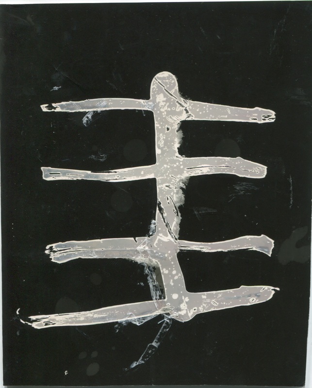
Floris Neususs
|
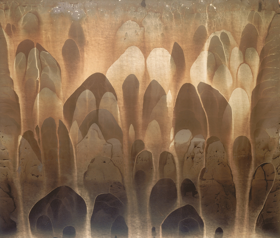
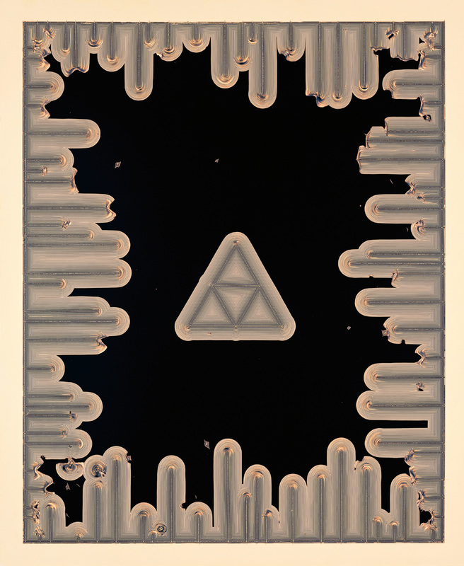
The work of Floris Neussus is entirely visually different from the work of Marco Breuer. Neusses' work is a lot more figurative, dealing with the human body and perhaps narrative. Whereas Marco Breuer's work is based on texture in most images, creating material lookalikes to existing ones, in Neususs' work, texture has been more or less overridden in most images- drawing focus to shape figure and tone. Although I appreciate the work of Breuer, I prefer that of Neusses as I find it more interesting. By removing colour and texture in Neusses' figurative pieces on the right, in some ways, they are made more intimate. This especially apparent in the bottom middle image.
|
|